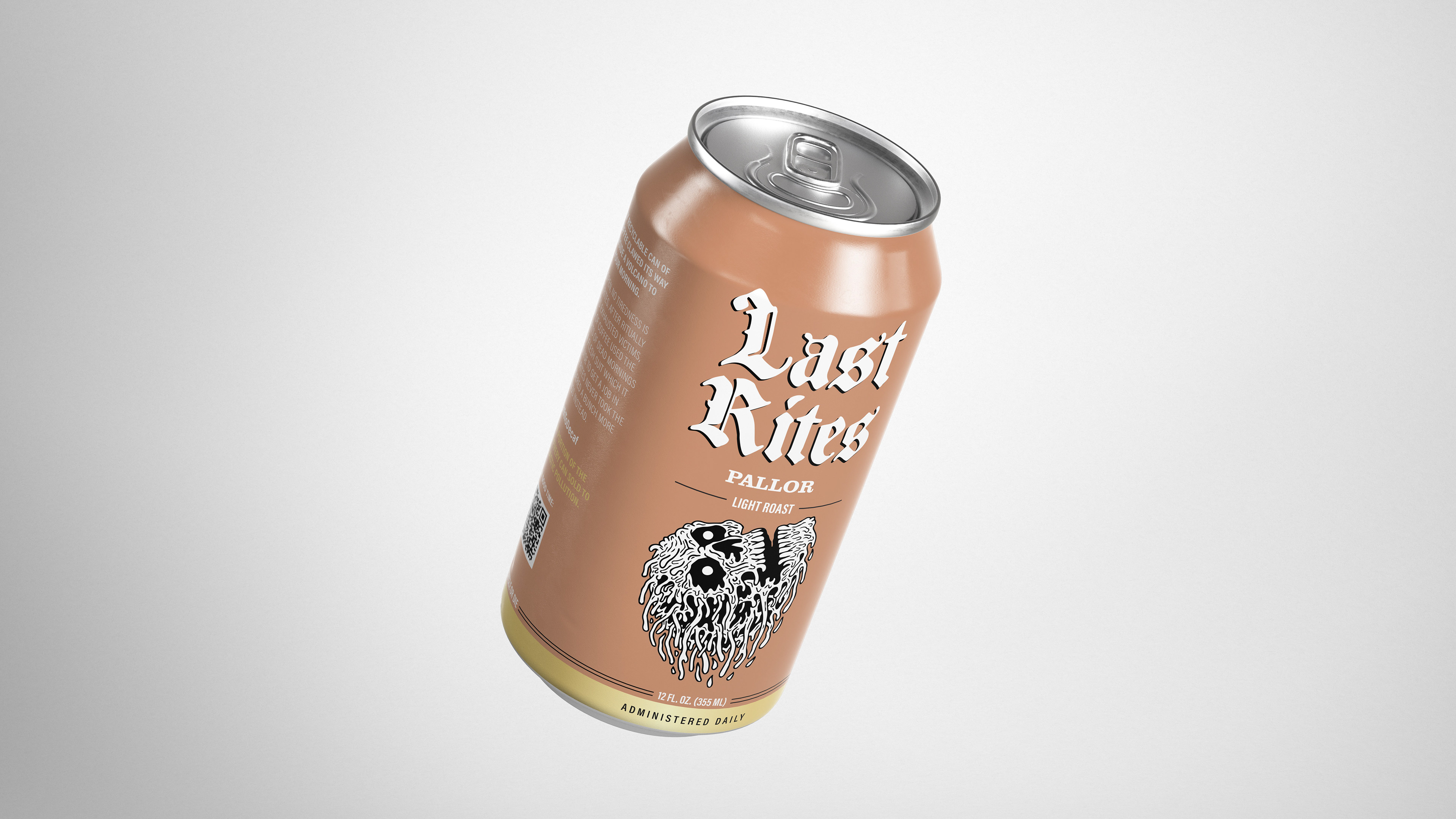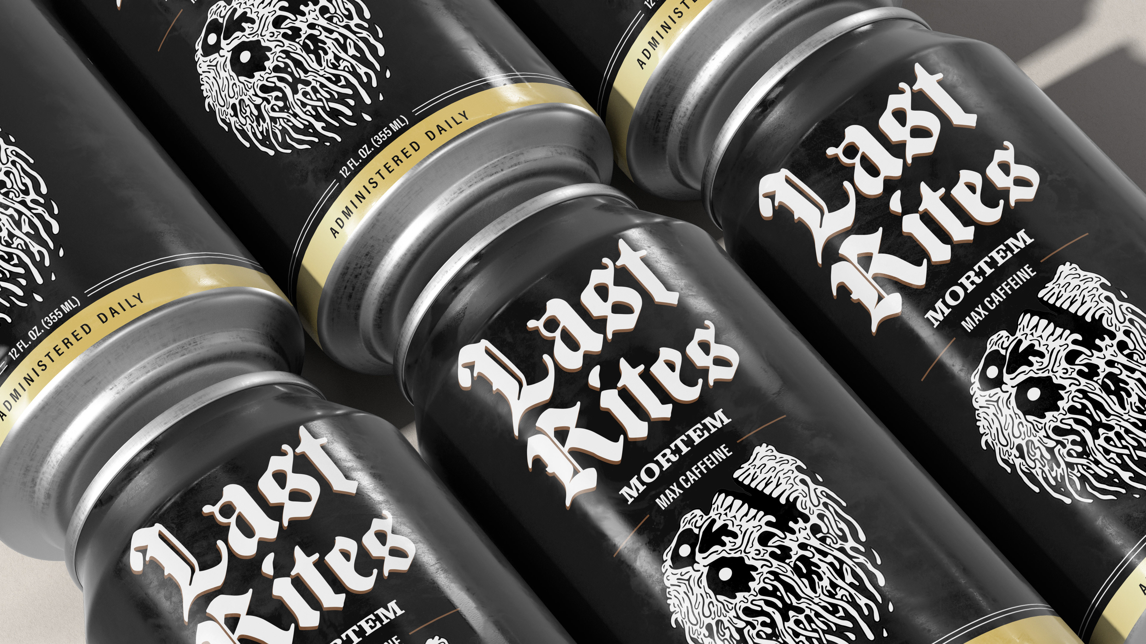
The Vision
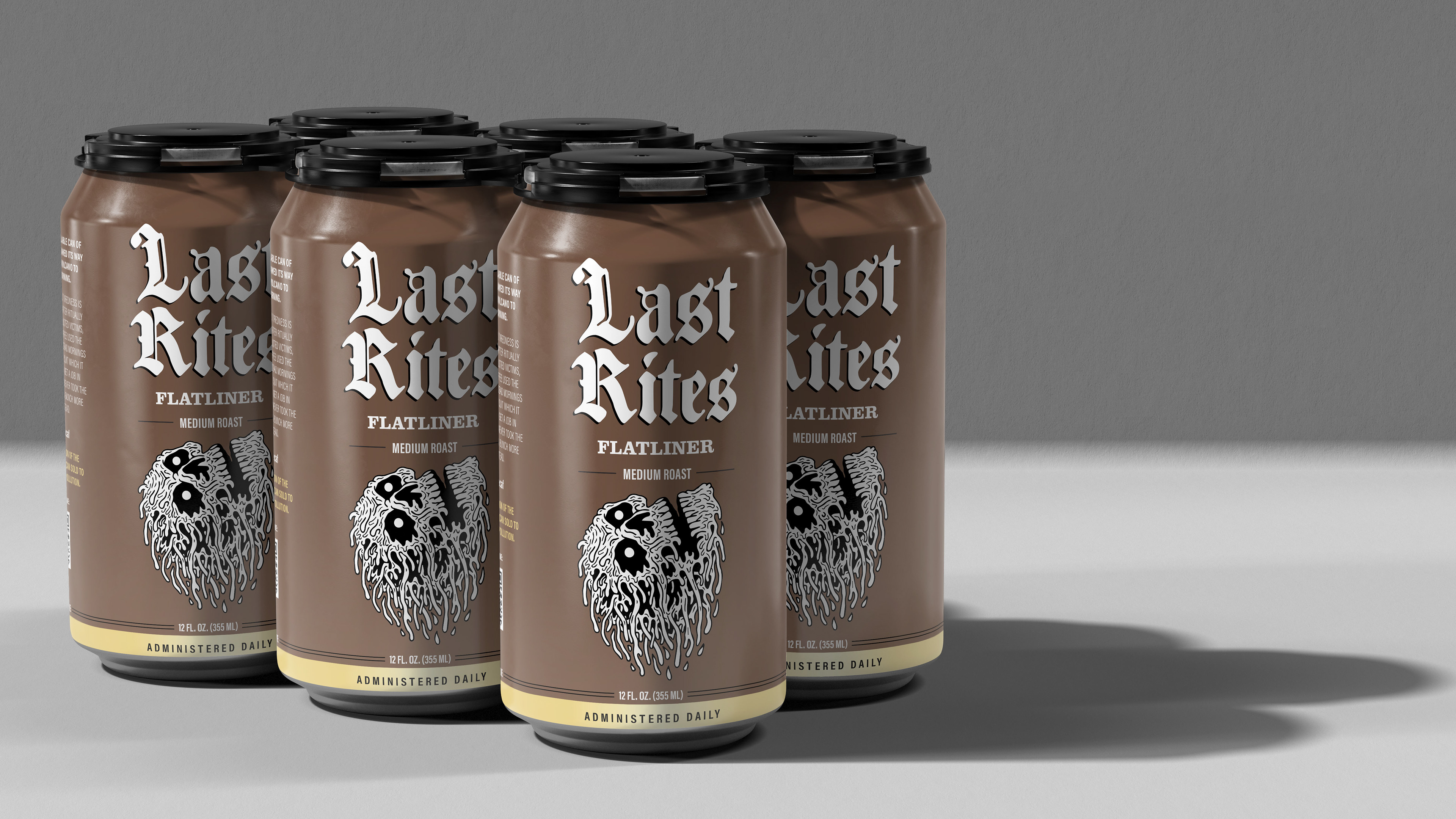
A canned coffee line built on a single truth: every morning is a small death, and Last Rites is the ritual that gets you through it. The extension applies Liquid Death's core sensibility, death as a metaphor for the mundane treated with complete casualness, to the one daily ritual more universal than hydration. Where Liquid Death made water something people actually want to be seen holding, Last Rites does the same thing for the morning. Same consumer, same attitude, different beverage.
The Strategy
The canned coffee category is massive and growing, but visually and culturally bankrupt. Every brand in the space is either chasing energy drink aesthetics or clean wellness positioning. Nobody is speaking to the consumer who finds both embarrassing. Last Rites identifies that gap and fills it with something Liquid Death is uniquely positioned to own: counter-culture identity, built-in brand awareness, and a can that people actually want to be seen holding.
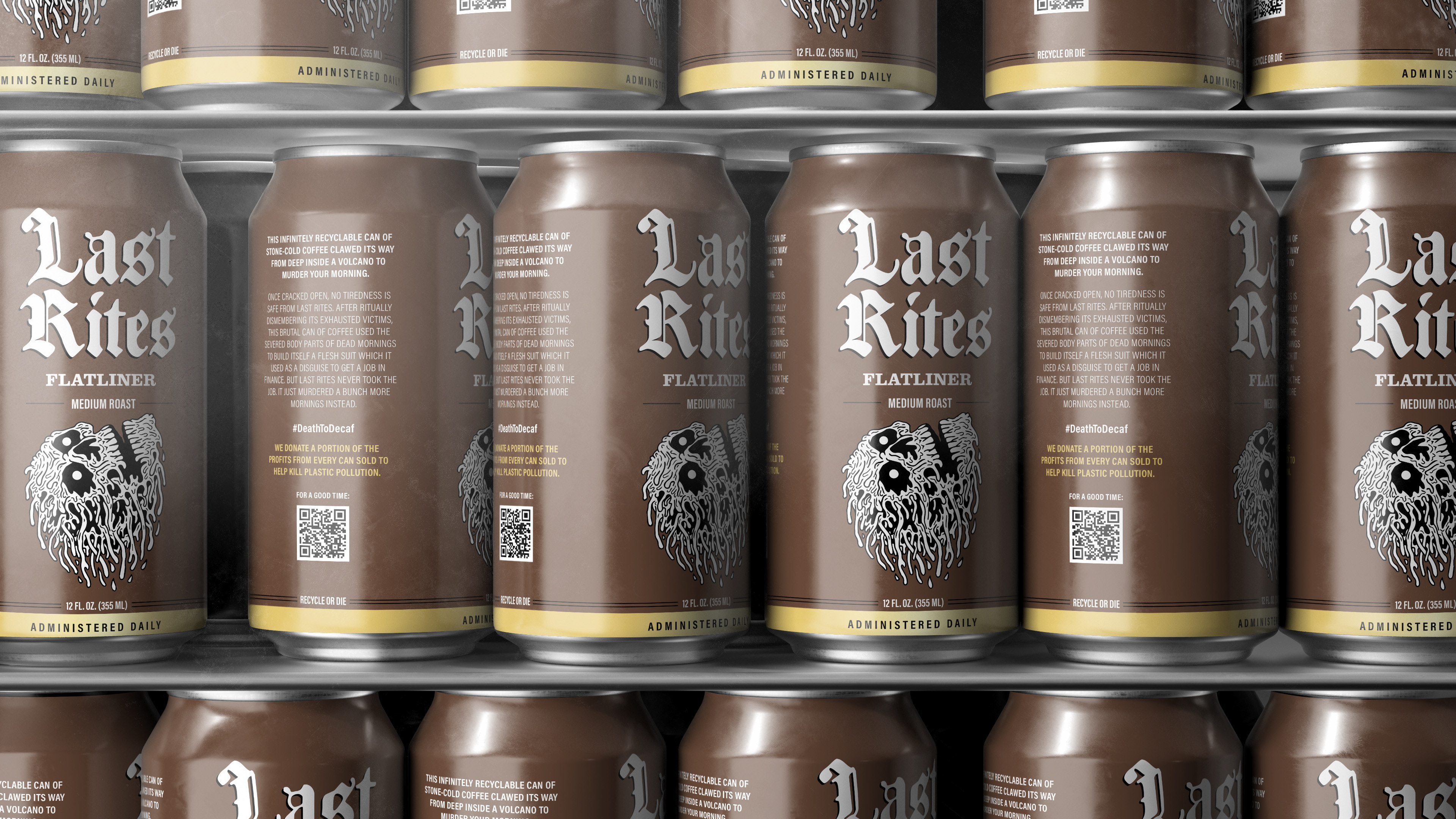
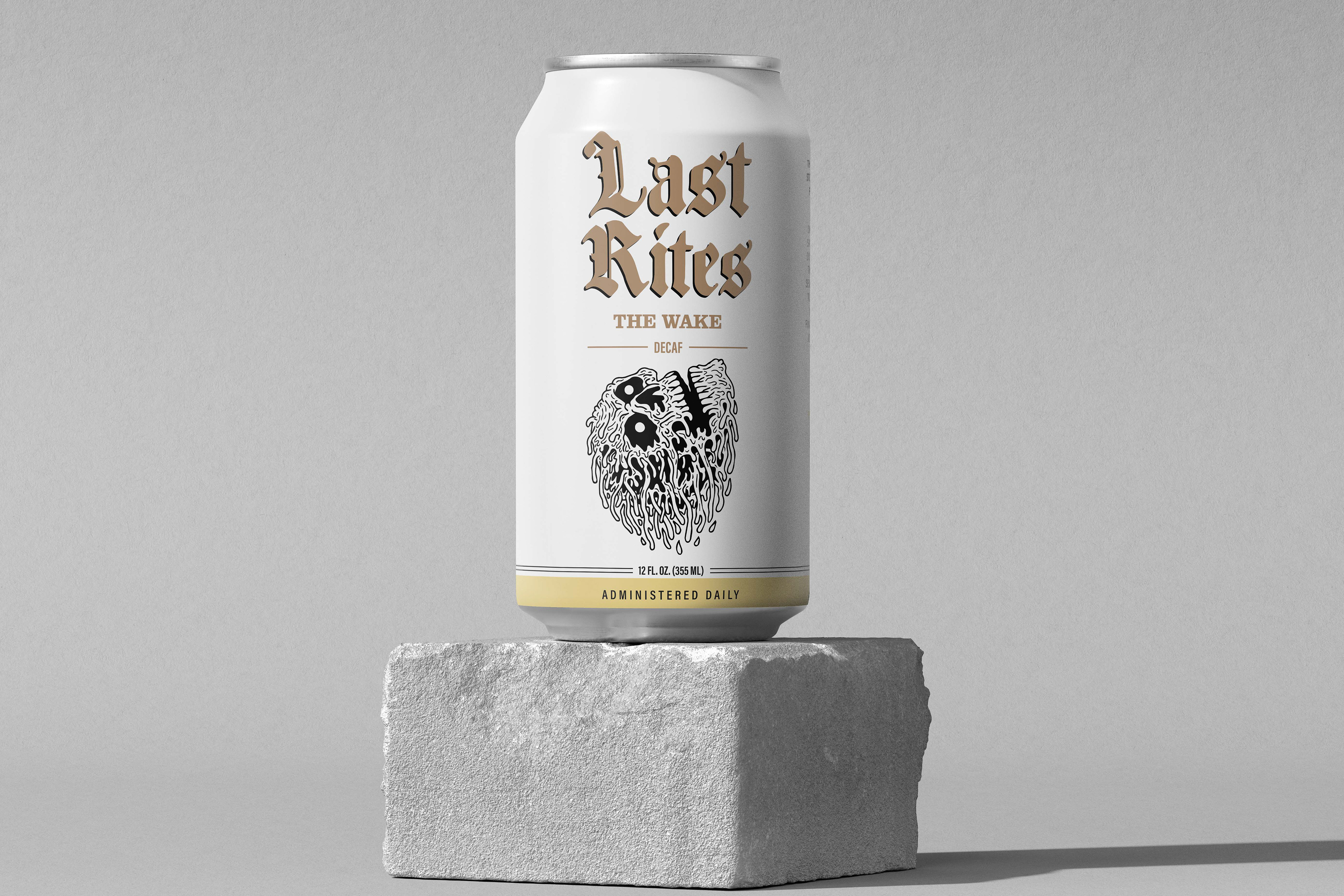
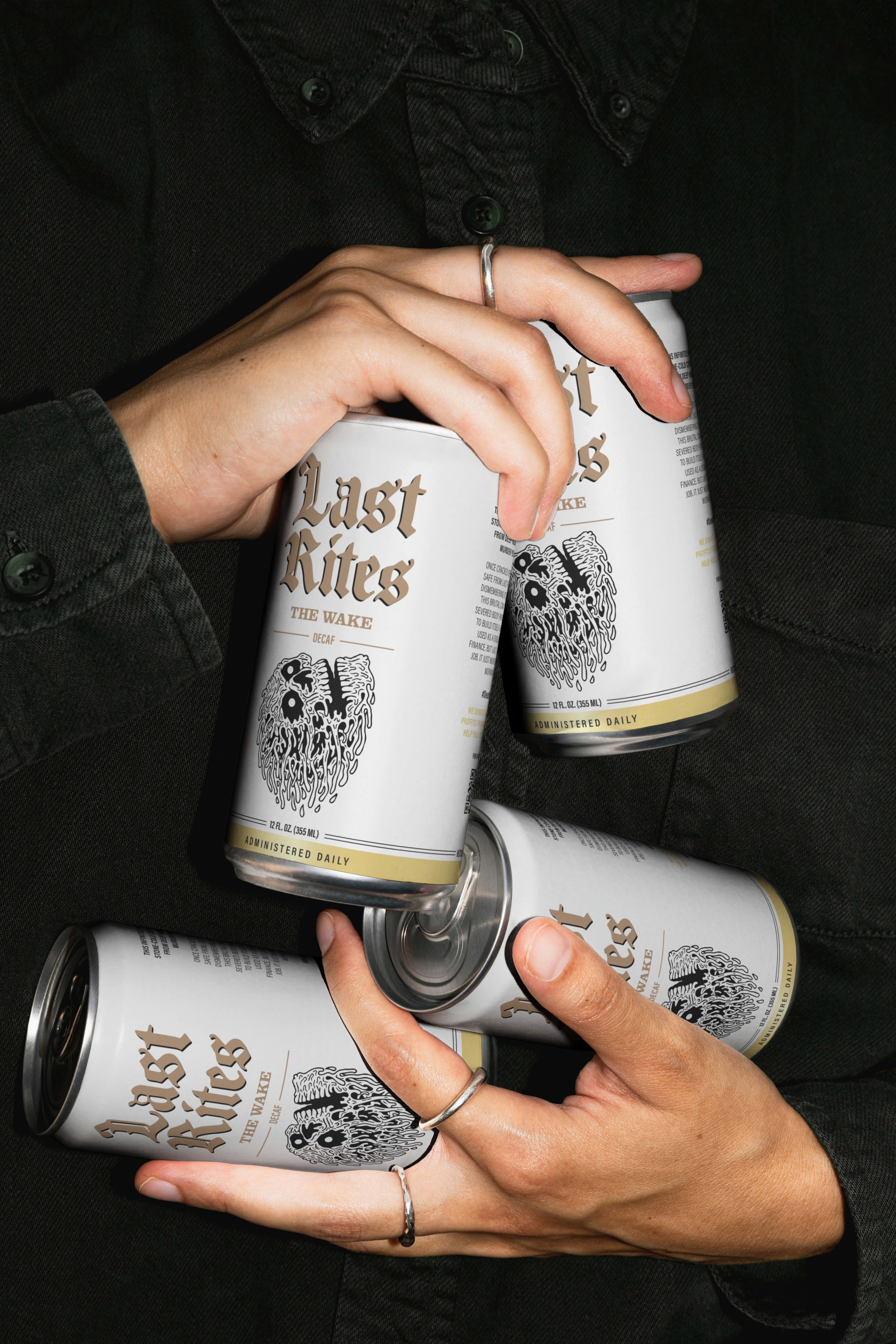
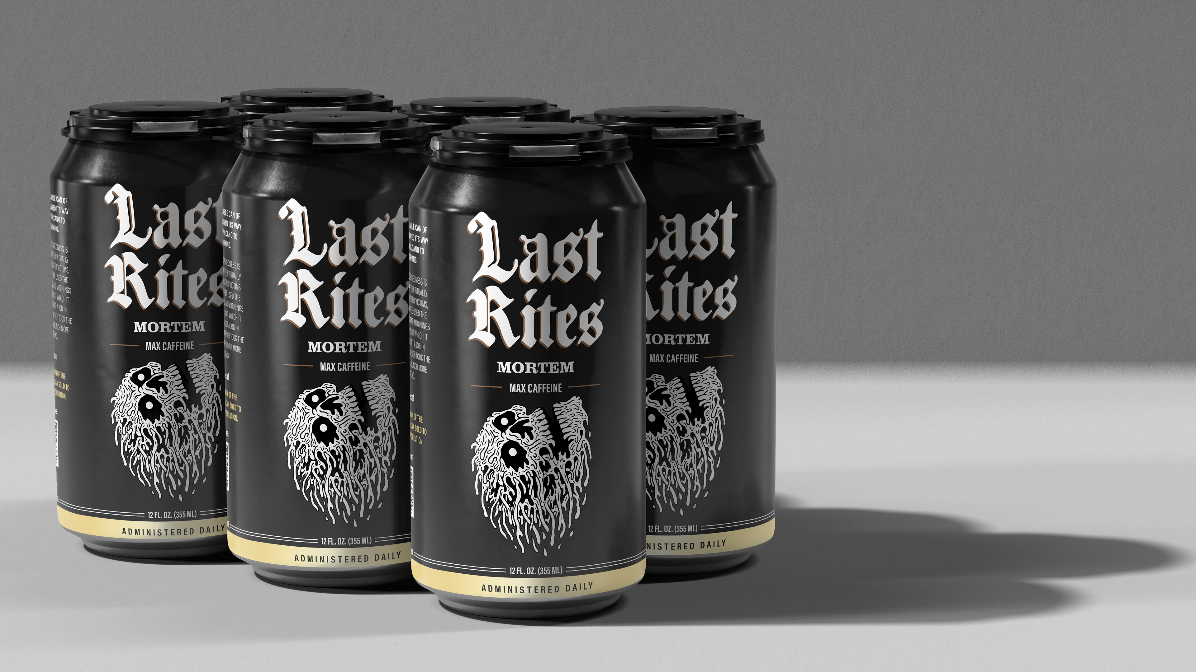
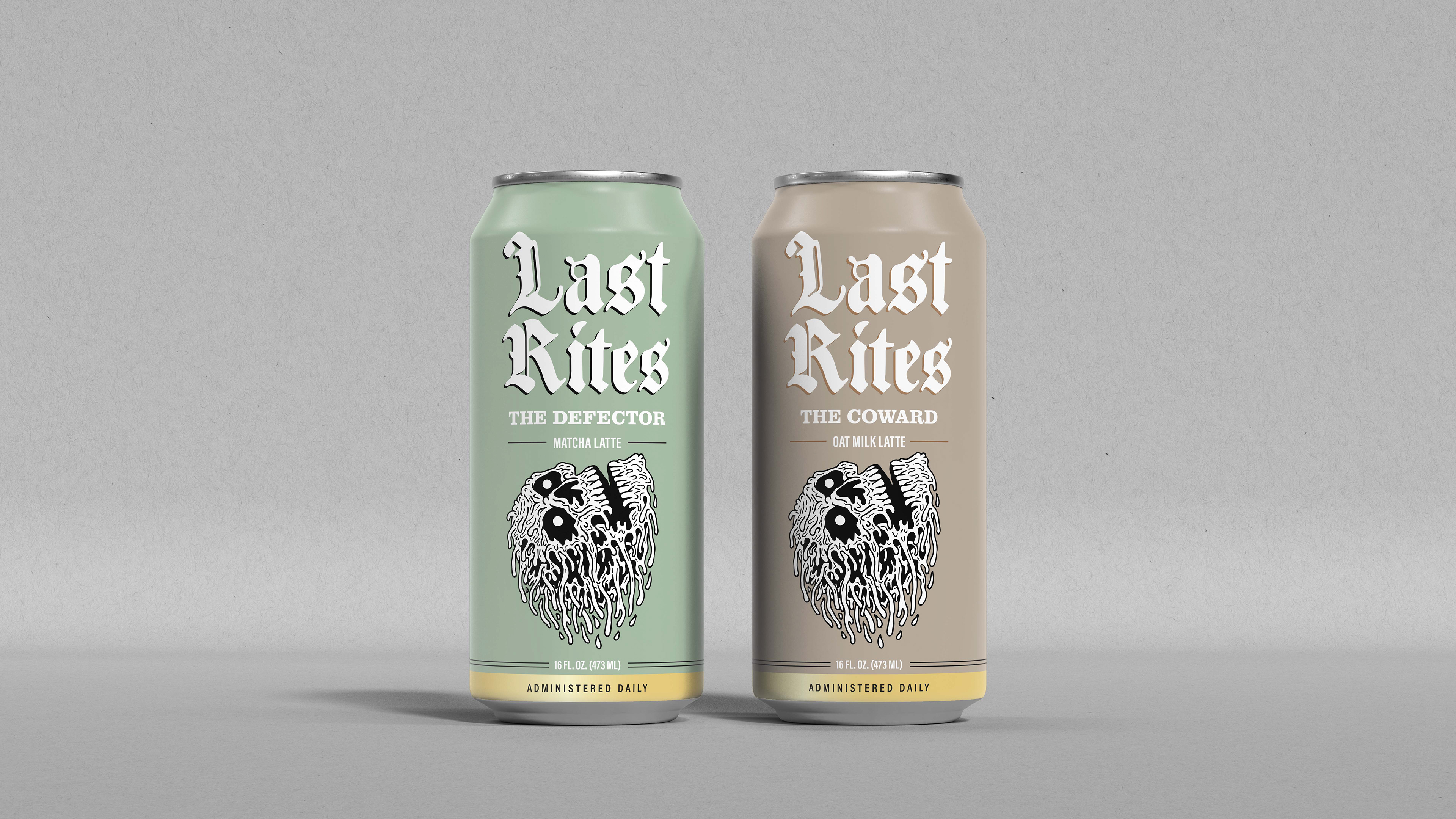
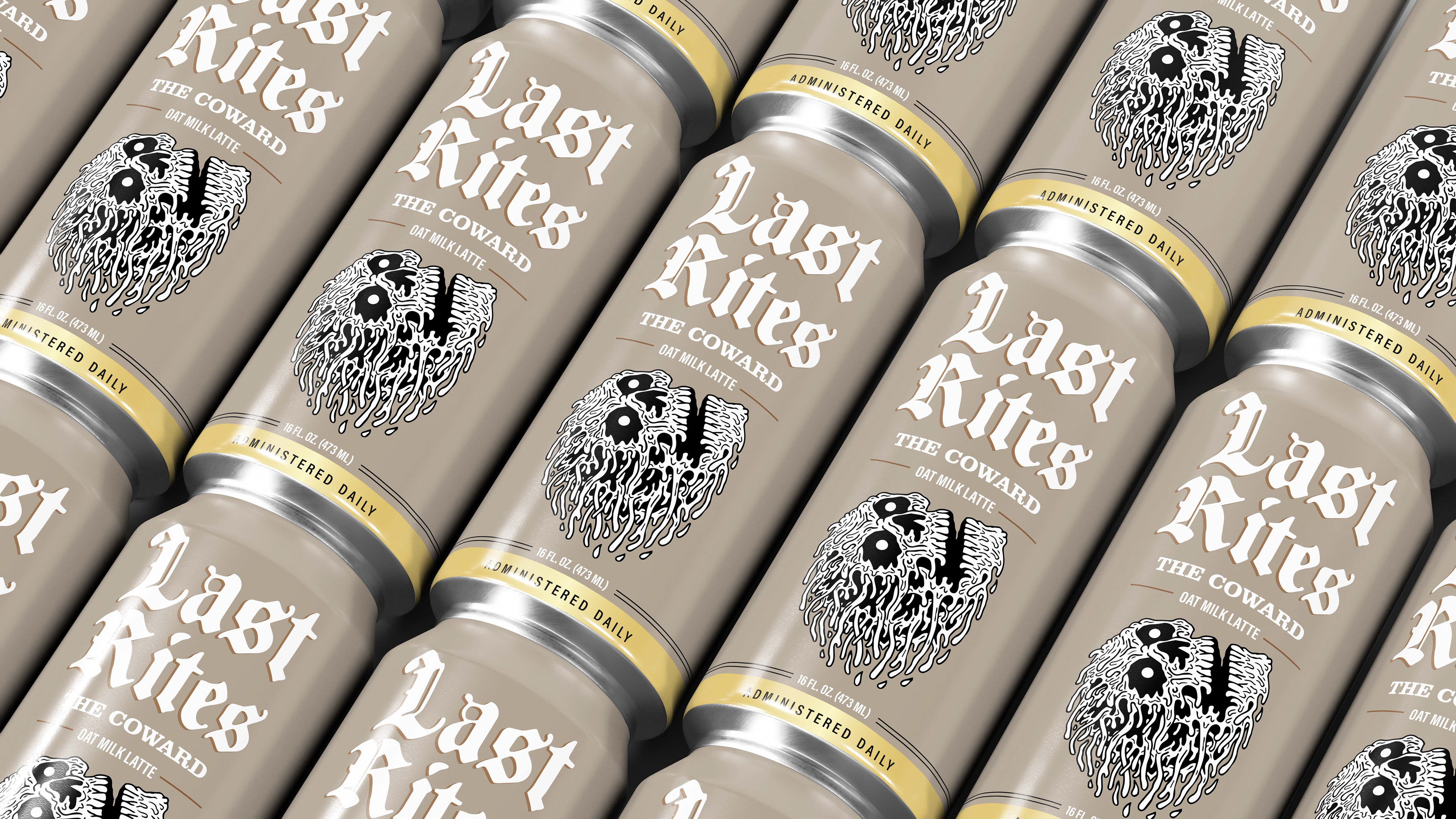
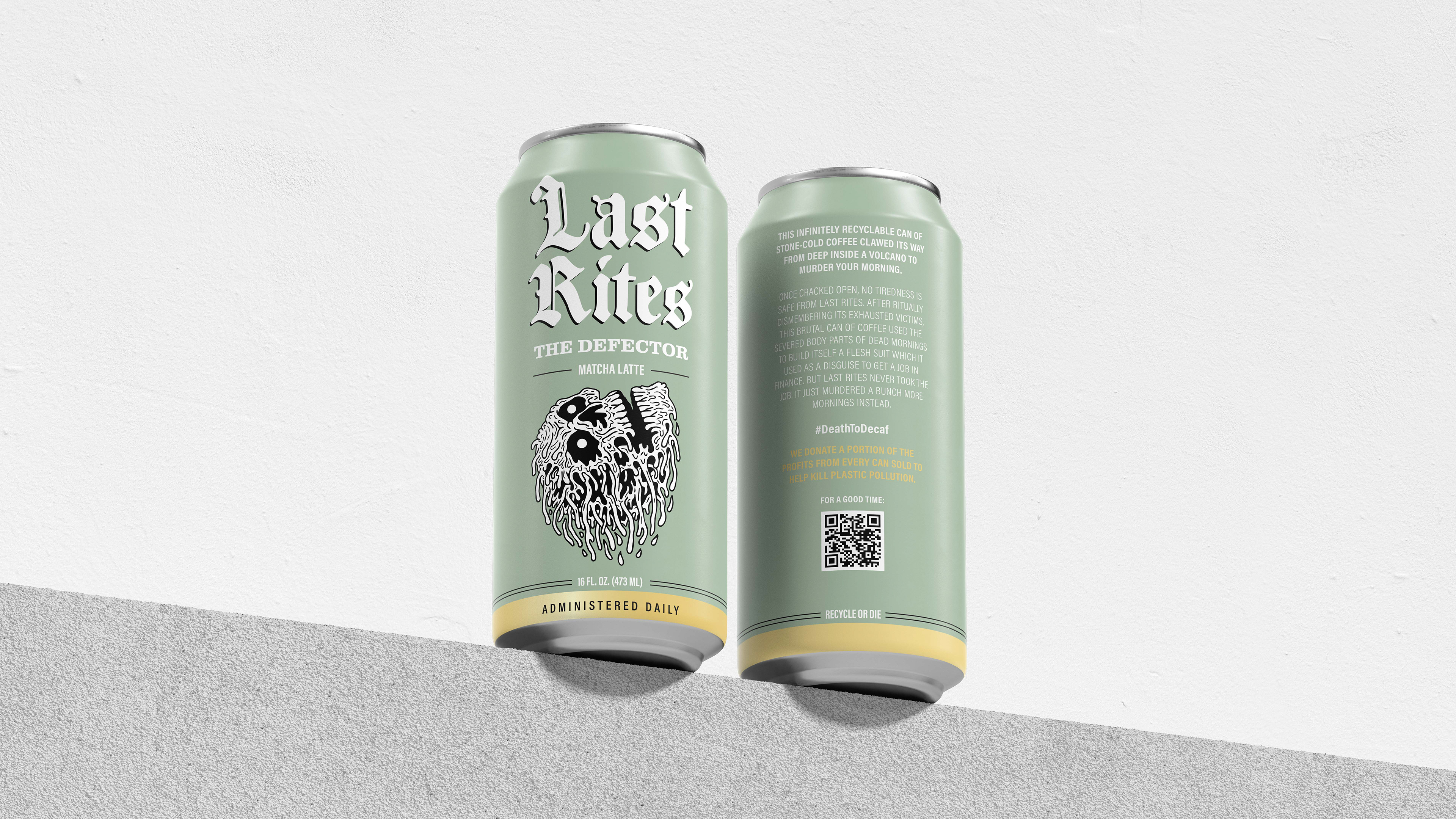
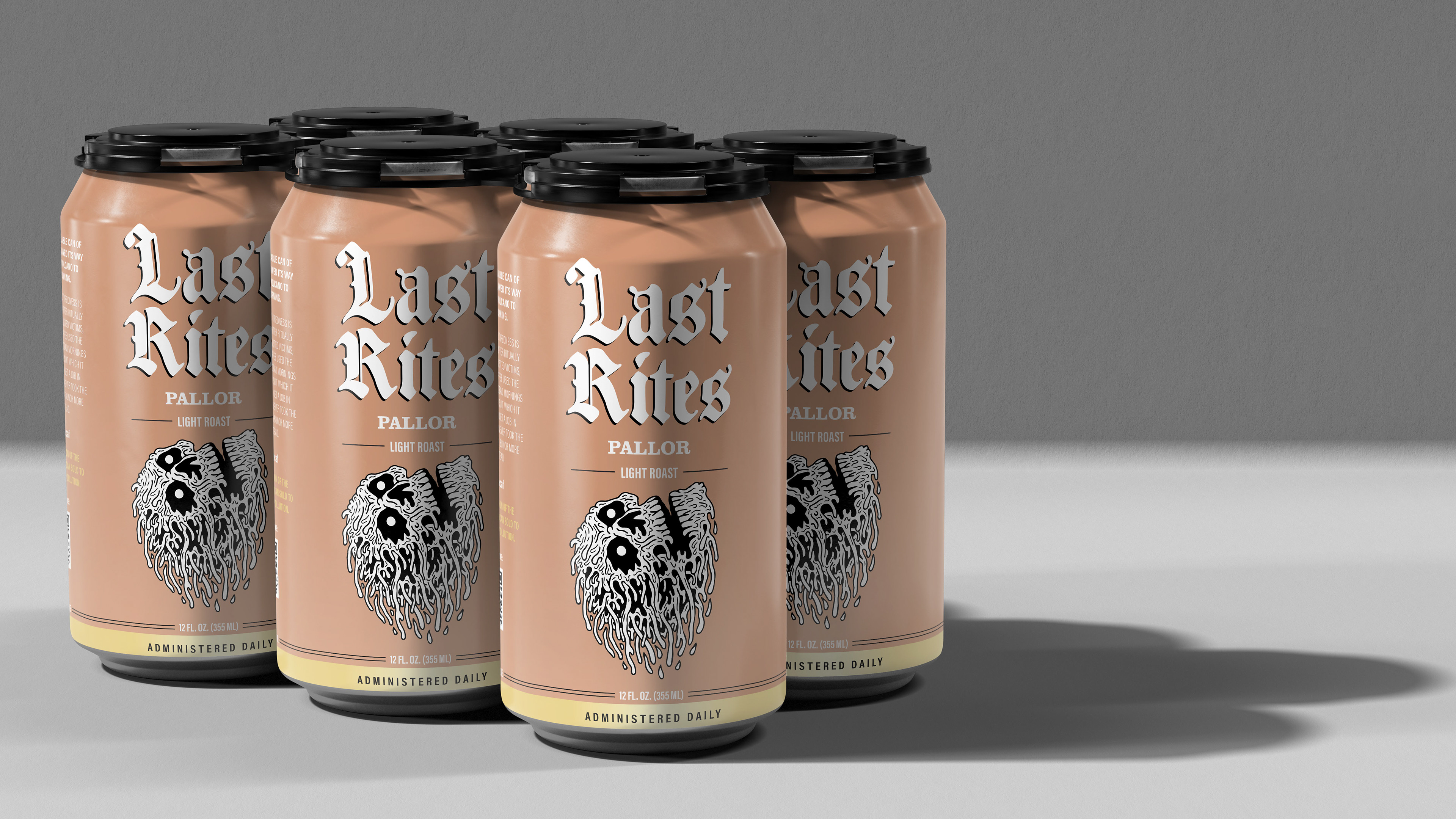
The extension was designed to feel like a sub-brand rather than a line extension. It inherits Liquid Death's typographic system and illustration language but establishes its own visual territory through a distinct color palette and funerary iconography. Engraving-style illustration, muted earth tones, a palette that shifts per SKU.
The Result
A complete six-SKU packaging system that extends one of the most distinctive brand identities in beverage into a new category without diluting what makes it work. The line is designed to sit on the same shelf as the brands it's replacing, right next to the energy drinks and the cold brew cans that have nothing interesting to say. Give that consumer something worth reaching for.
PROGRAMS USED
Adobe Photoshop
Adobe Illustrator