The Vision
Casa Capón needed a brand identity for a Peruvian-Chinese fusion (chifa) lomo saltado sauce, one that could carry the flavor's dual heritage without leaning on either cuisine's usual visual clichés. The mark needed to feel handmade and rooted, not mass-market CPG.
The Strategy
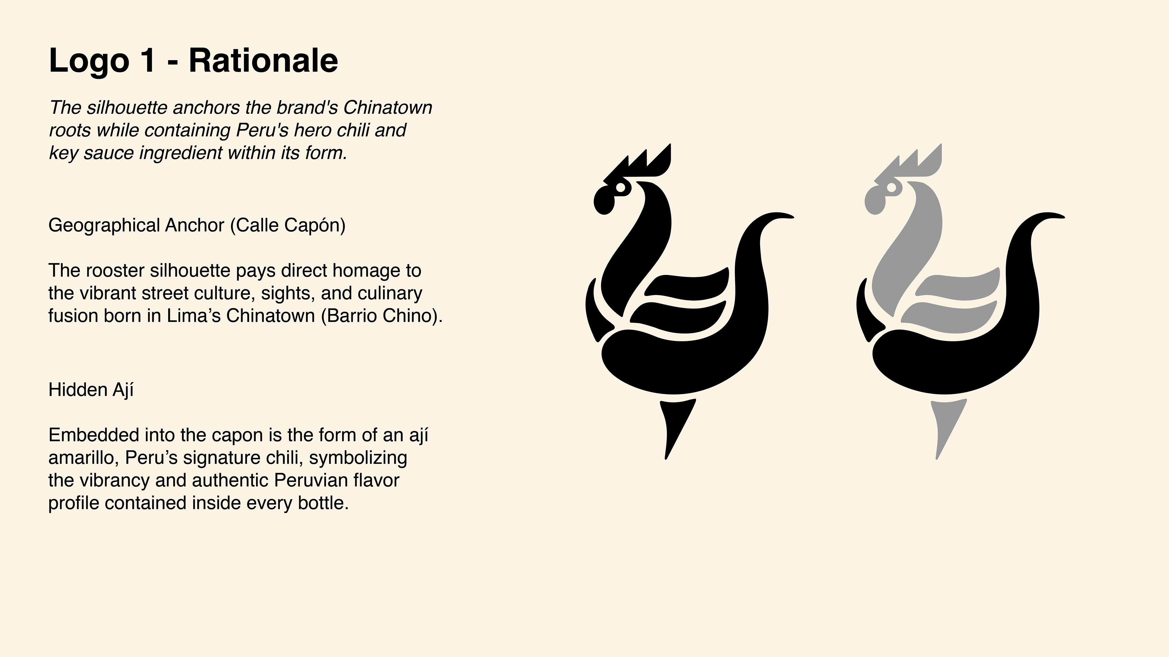
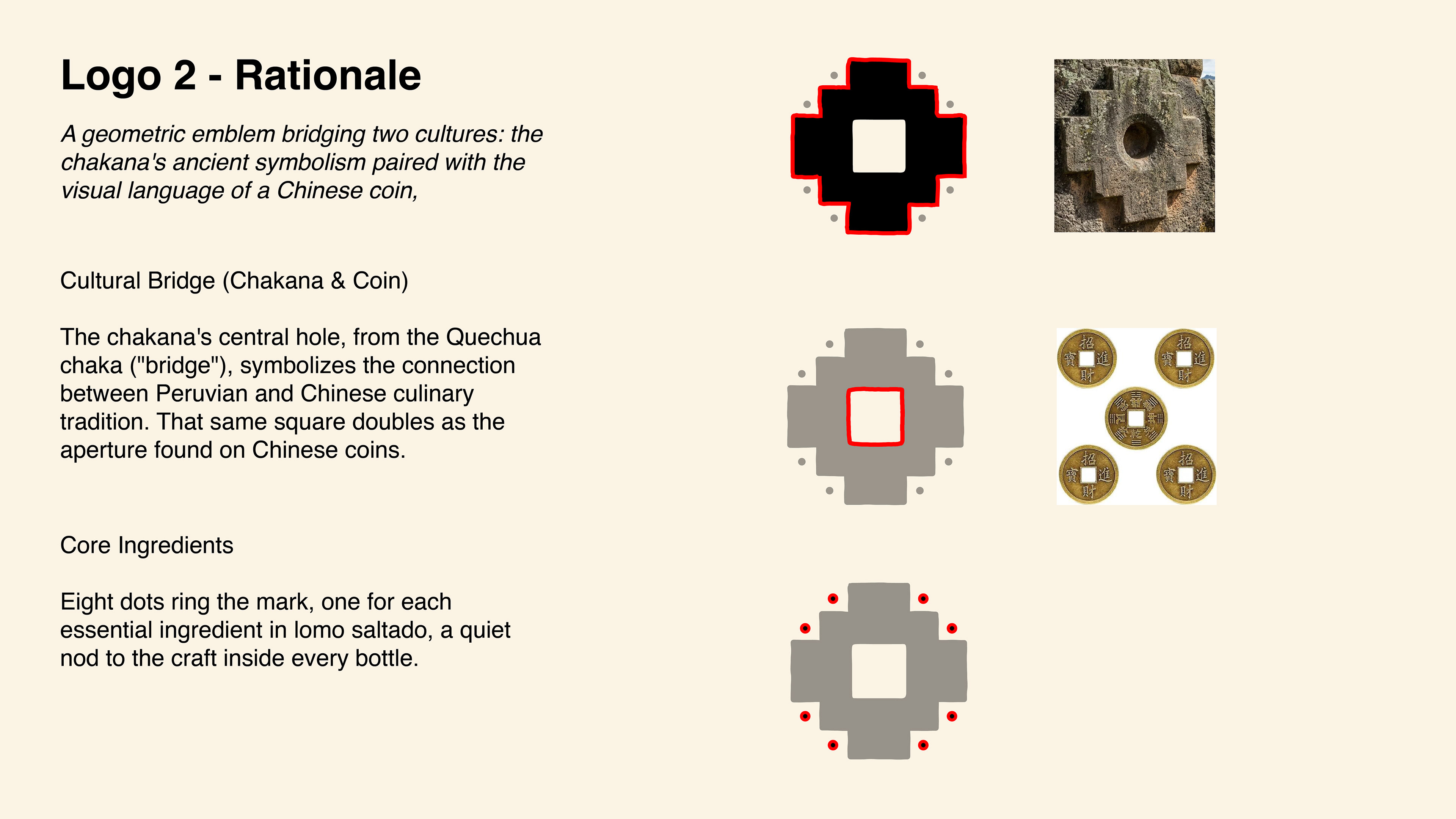
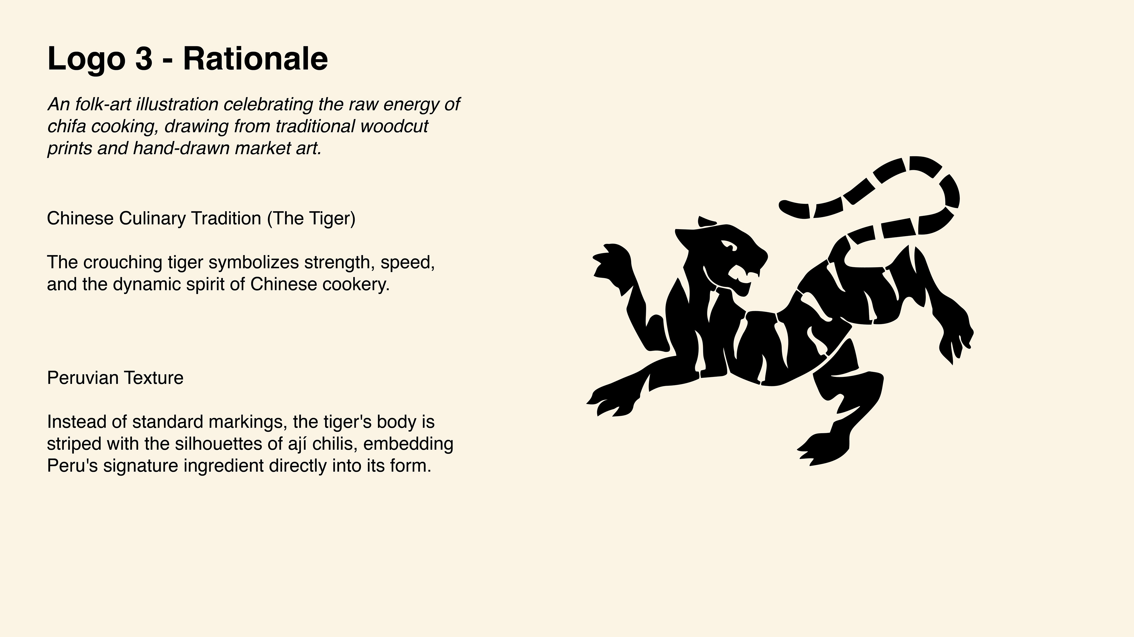
The name comes from Calle Capón, the historic street in Lima's Chinatown (Barrio Chino) where chifa cuisine was born, and the primary mark, a rooster silhouette, pays homage to that neighborhood, with a hidden ají amarillo chili shape worked into its form. Two other directions were explored alongside it: a chakana (Incan cross), and a tiger mark striped with ají chili silhouettes. The rooster moved forward as the primary mark, and went through a second round of refinement to resolve the client's request to also work in a flame and a "CC" monogram. Rather than adding separate elements, the solution reads both C's within the rooster's body itself.
The Result
A fully signed-off primary mark. CPG packaging design for the sauce line is currently in progress, following the same present-revise-finalize process used for the identity.
Programs Used
Adobe Illustrator
Adobe Photoshop
Deliverables
Brand Identity
Logo System
Typography & Color
CPG (in progress)
Previous Branding
The Brief
Casa Capón came to the table with a name, a flagship product, and a story, but no visual identity to match. Aside from the brand name and a color palette, no other visual direction was given. The brand needed a mark that could carry the weight of two cuisines at once: Peruvian and Chinese, fused into chifa. The identity had to feel handmade and rooted in that history.
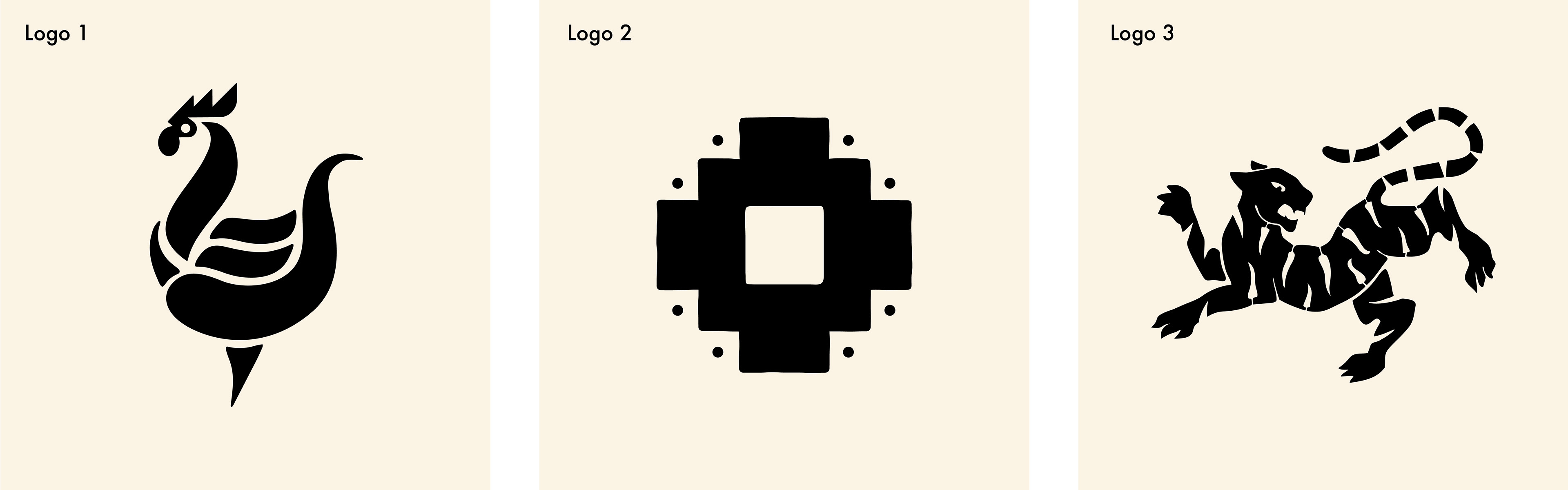
Three directions
Before landing on a final mark, three concepts were explored, each pulling from a different symbol of the brand's dual heritage.
Typography
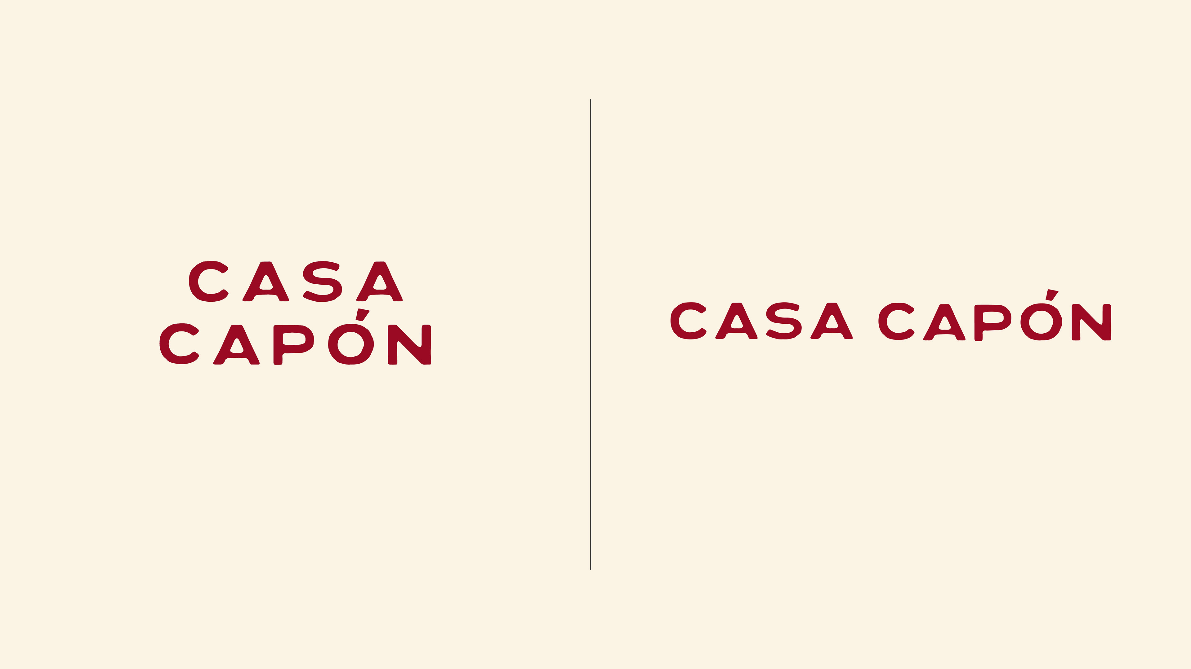
Custom typography felt right for the wordmark, so we sourced a font from independent designer Taylor Penton rather than reaching for something free or generic. The typeface, Lennon, is bold and condensed enough to hold up at small label sizes, with a slightly hand-cut, uneven quality in the letterforms that keeps it from feeling stamped out by a machine.
The tilted accent mark over the Ó carries that same handmade energy through to the one Spanish character in the name. Paired together, the wordmark and the rooster mark read as one system rather than a logo with type stuck underneath it.
Exploration
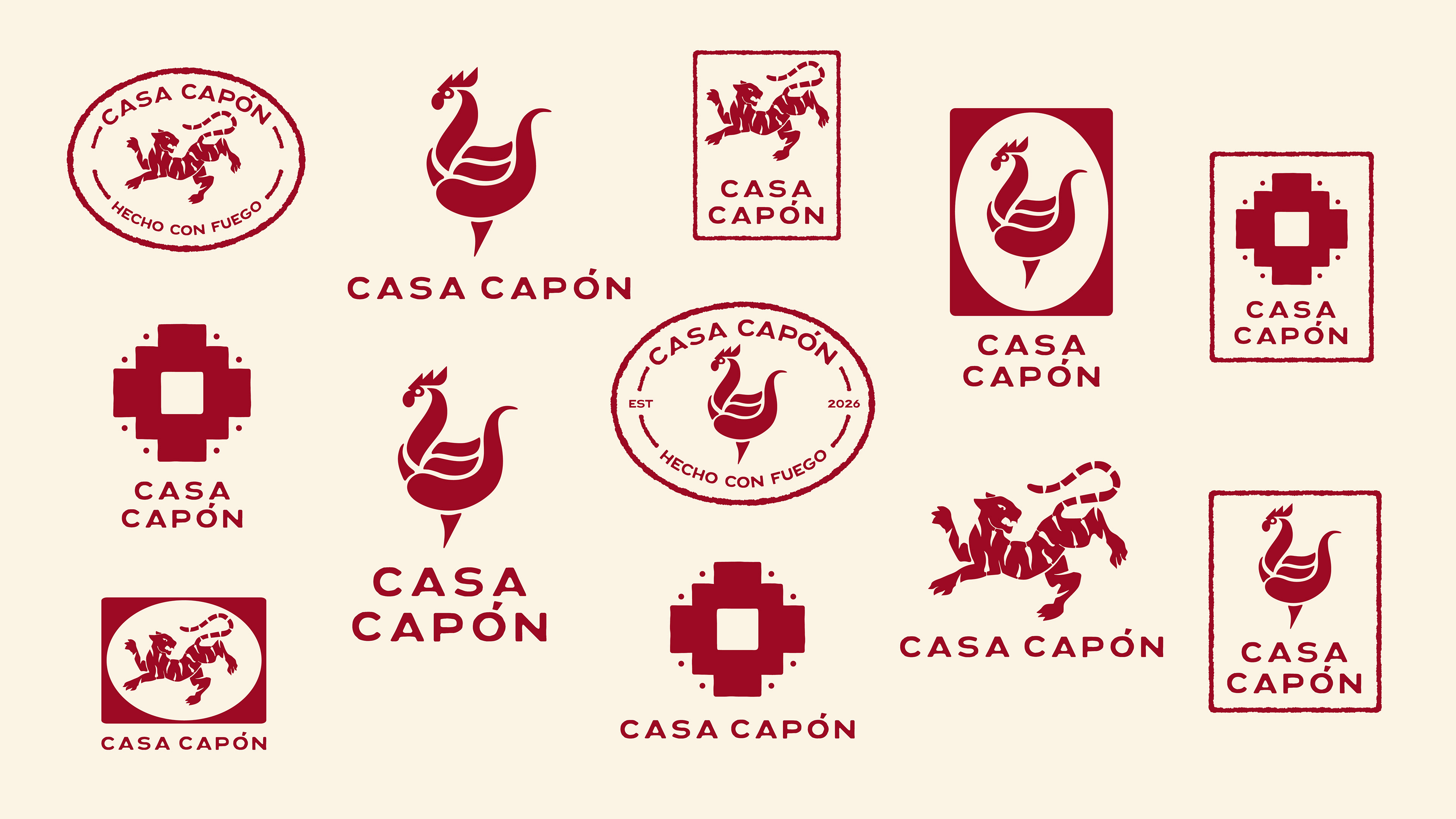
Aside from the brand name and a color palette, the client came in without a defined visual direction, so I wanted to give them a range of options to react to. The mark and the Lennon typeface were tested together across seals, badges, and stamps, letting me gauge what felt right for them before narrowing in on a direction.

Selected direction
The client gravitated toward the rooster mark, drawn to the way it nodded to Calle Capón and incorporated the ají amarillo, which is not only the hero chile of Peru, but the hero ingredient of lomo saltado.
For the next round, they asked for a few refinements:
•Keep the hidden ají amarillo chili intact
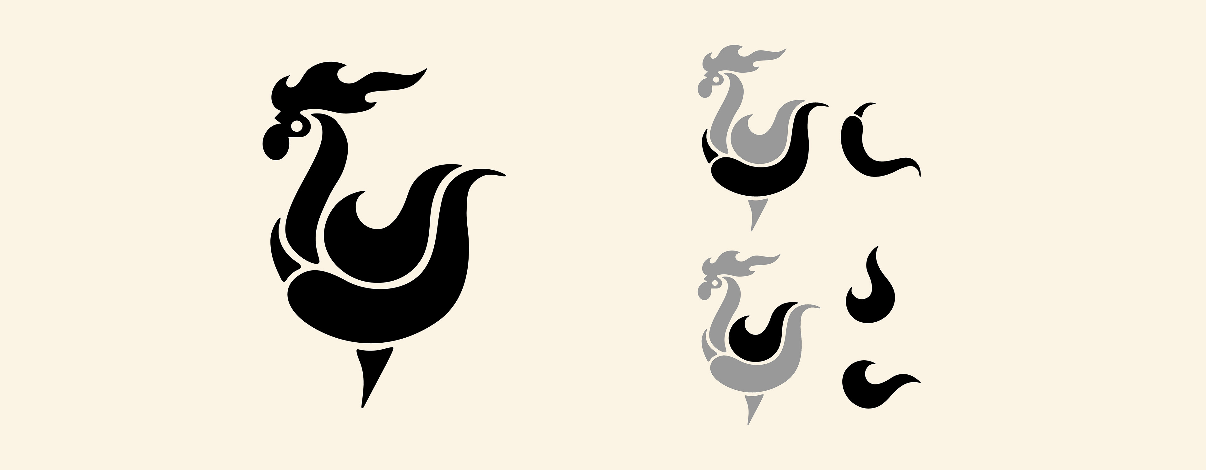
•Push the mark to feel more "flamey" to reflect the wok-cooking process central to the sauce
•Incorporate two C's for Casa Capón could be worked into the form.
Revision
Added more flame detail to the rooster's head to push the mark further into that wok-fired feeling. The body was also reworked into a flame shape, one that doubles as a "C" for Casa Capón when turned on its side. Through it all, the hidden ají amarillo stayed intact.

Final mark
The client decided to go with the original rooster head, keeping the mark clean and unmistakably tied to the product rather than risking confusion with a hot sauce. With the logo finalized, the project is now moving into CPG packaging design.